Project Title
Unannounced Game, codename “Crest”
Project Synopsis
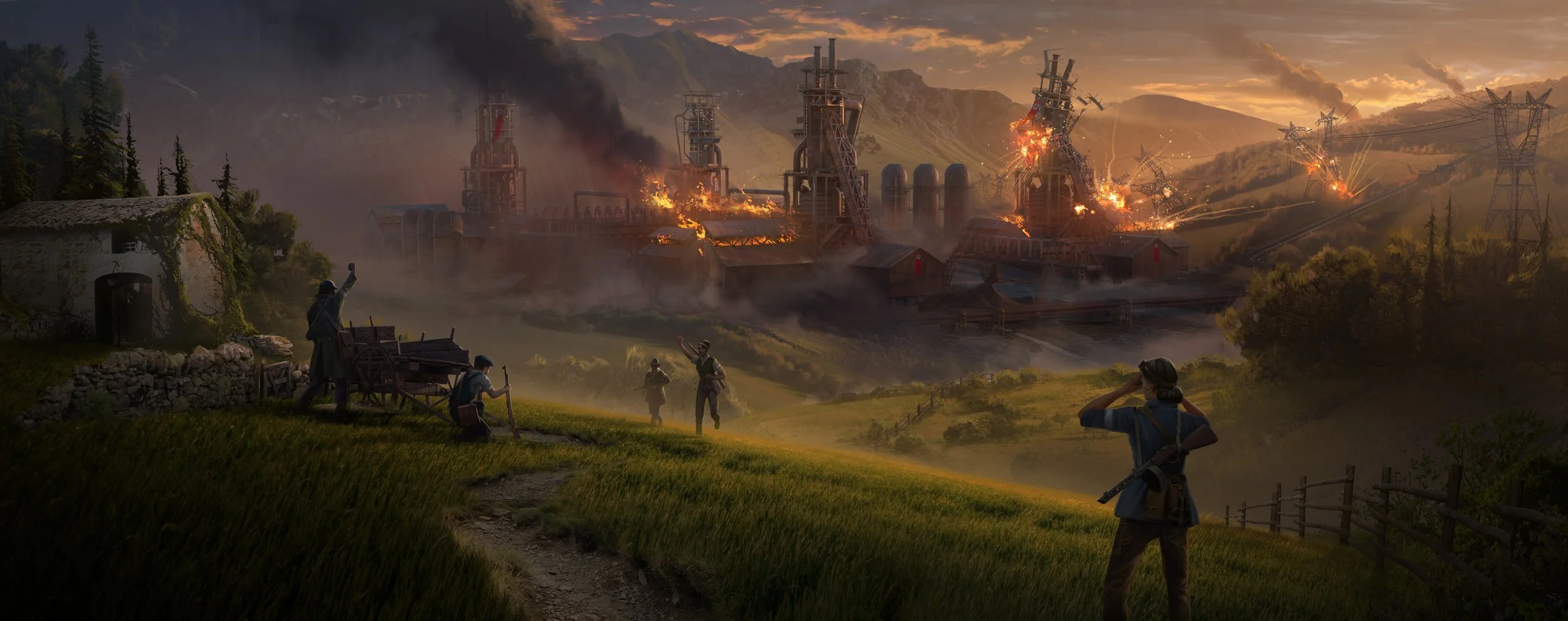
When I first joined Ubisoft, I was introduced to a new project that was initially called Firestarters, which later evolved into Crest. The game is set during the French resistance against the Nazi warmachine, where your role is to disrupt enemy supply lines, gather intelligence, and fight back using clever and unconventional tactics.
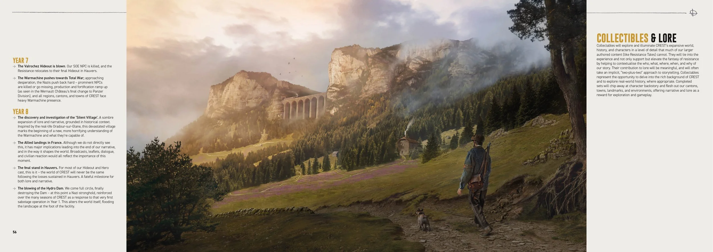
At the early stages of development, we explored a wide range of themes and visual styles. Originally, the warmachine was portrayed as deeply menacing, with a darker tone overall. However, as the project developed, we realized a lighter, more stylized approach was more fitting. This shift influenced the visual direction significantly—leading to a more muted color palette, inspired by the texture and tone of parchment paper.
A major part of my role involved producing onboarding materials to help new team members quickly understand the project’s vision, tone, and direction. I also had the opportunity to help showcase our evolving concept art—presenting mood boards, documentation (Narrative Bible) and posters that captured the game's shift in tone and style. These assets played a key role in aligning cross-disciplinary teams and guiding the creative process forward.
Project Client
Ubisoft Reflections & Leamington
Project Type
Brand Development, Print Materials, Powerpoints
Narrative Bible Key Lore


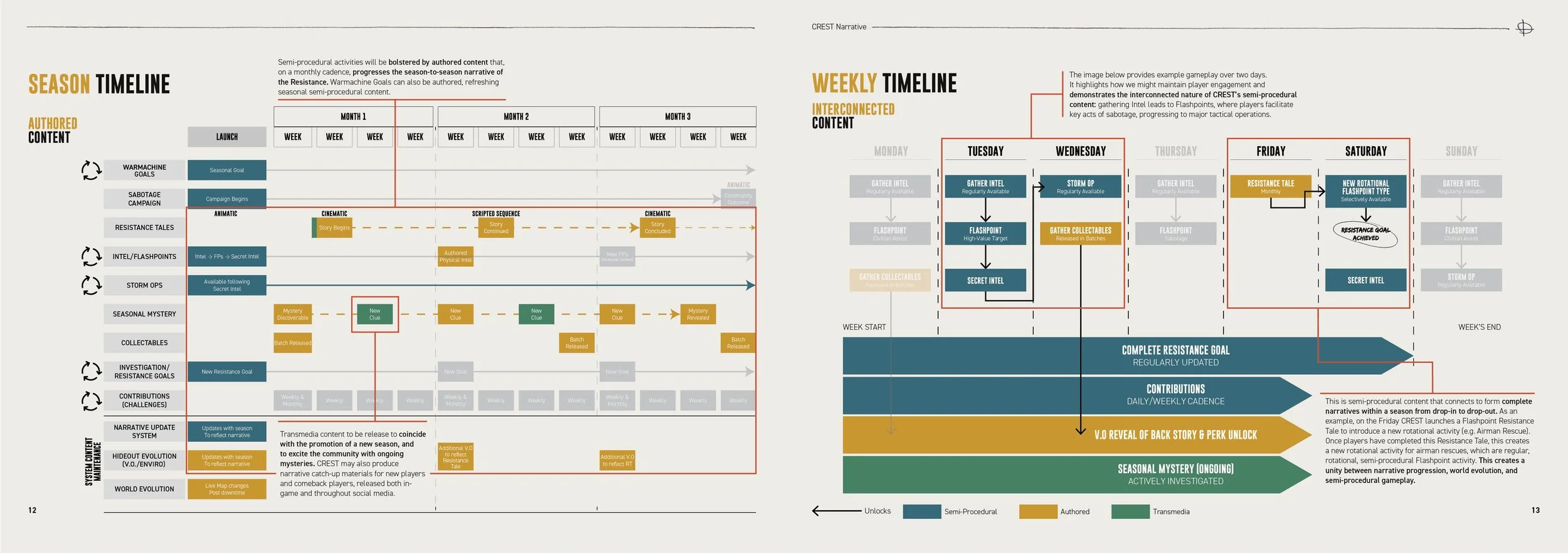
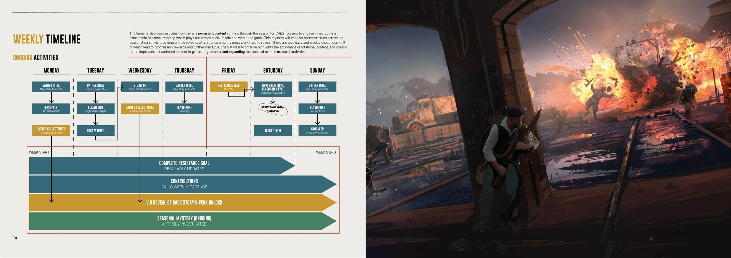

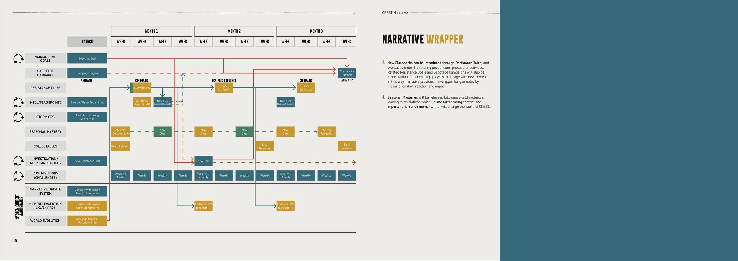


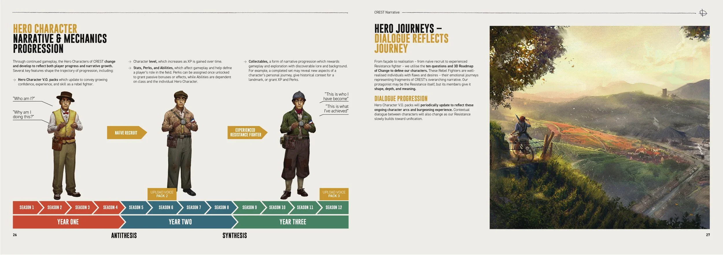


Narrative Bible Means and Delivery


Narrative Bible Narrative Treatment


Narrative Bible Theme and Tone
Project Synopsis
The Crest Alliance Map was designed to highlight the studios involved in the project, with Ubisoft Reflections (my studio) and Ubisoft Leamington acting as co-leads, supported by other studios brought in for specific roles. Given the importance of this, especially for presentations to directors at head office, we wanted the PowerPoint to be engaging and easy to follow.
I proposed making the slide interactive, with customizable animations that could adapt to different presenting styles. This allowed the presenter to control timing, such as choosing between clicking to advance or having the animations play automatically, depending on how they intended to walk through the slide.
From a technical standpoint, I created multiple layered backgrounds in Photoshop and Illustrator using a world map base and aged it with colours and paper overlays. As the slide progressed, different zones would highlight dynamically to reflect studio involvement.
To ensure usability, I also designed the system so anyone could download a studio location photo online, apply a filter I defined for consistency (below), and import it directly into the presentation.
A demonstration video for my initial pitch to the presentation owners. This was at the start of Covid working from home, hence the VPN display and tiny delay.
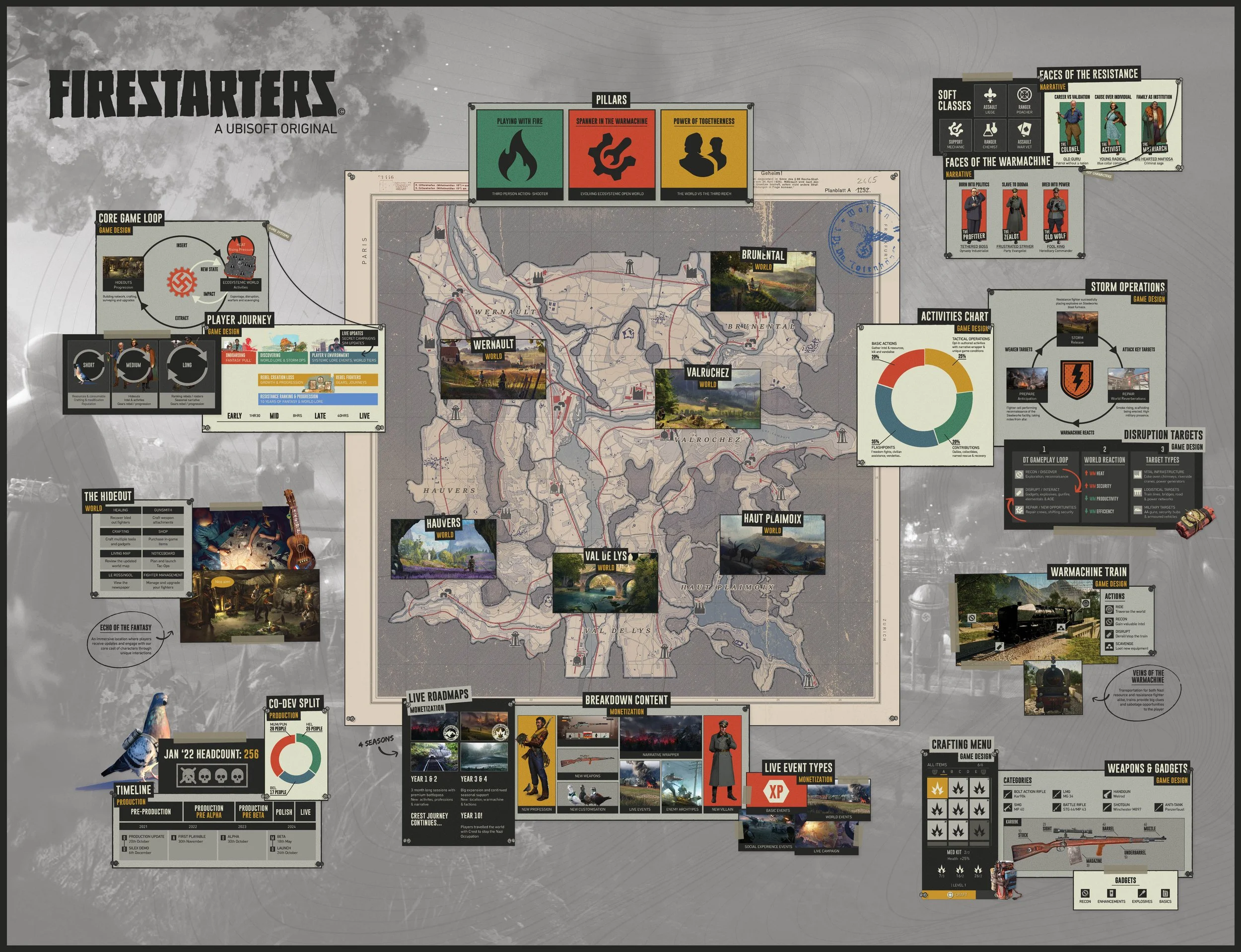
Project Synopsis
This is the original Scope Poster I created during the
early stages of the project, back when it was still called Firestarters. The team requested a highly illustrated poster that would serve as a pinboard — a central reference point where key data and infographics could
be displayed for new team members.
I collaborated closely with the UI team to ensure alignment with their iconography, panel layouts, and formatting, aiming to replicate the look and feel of
in-game menus at that point in development.
As evident in later materials like the Narrative Bible and Alliance Map, the visual style evolved significantly — shifting from a heavily stylized design to a more refined and natural aesthetic.